Cindy's Mid Modern Art Blog
It’s a Man’s World I
By: Pauline Boty~1964
The painting is currently located in the Tate Modern in London. This art piece is an example of pop art. Pop art was very popular in the 1960’s. In this specific painting, it’s showing us all of these men and the things they have accomplished, hence “It’s a Man’s World I”. The artist had intended for the men to be there in representation of the building block for America and the government, however, I don’t think that’s what most people get from looking at the painting. This piece has a lot of color in it, which helps gather the attention of the audience. The painting looks as if pieces were cut from other pieces of art and put together, which is implying that we are all together in this world. I like that there are different textures used in most of the little paintings. It gives it a very unique look. I personally wouldn’t own this piece because it’s just not to my liking, however I do like how the artist did this piece.
Lovers
Created By: Rosalyn Drexler~1963
The art piece is currently located in the Whitney Museum of American Art in New York City. This is another example of pop art. In this painting, it’s showing how when a couple are together, there are moments of euphoria and also of misfortune. This is a very simple piece that doesn’t have a lot in the background to make sure the viewer sees what the artist wanted you to see. There is a woman and a man kissing each other in the lower left corner and in between that is a bunch of random objects leading up to the same couple going through a rough patch. I like this piece because I think it’s important to be reminded that no relationship is perfect. I would not personally own this piece because of the amount of red there is.
Marily Diptych
Created By: Andy Warhol~1962
This painting is currently in Tate Modern in London. The art piece is an example of pop art. This painting has the same picture of Marilyn Monros on both sides, one with color and one without. The pictures in the painting were taken from a movie that Marilyn starred in. The artist created this piece simply out of admiration for Marilyn Monroe. When first looking at this photo you would probably see the colorful side, which allows people to see what she truly looks like and then on the right with no color, giving people the option to imagine what she might look like. The art looks faded and distressed, which I really like. This was commonly done because people enjoyed the way it looked. I would own this piece because I like Marilyn Monroe and I also think that the distressed look is really neat.
Retroactive II
Created By: Robert Rauschenberg~1963
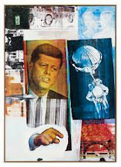
This painting is currently located in the Wadsworth Atheneum Museum of Art in Connecticut. This piece is an example of pop art. The artist used pictures and then transferred them to this canvas through a process called silkscreen series. Silkscreen series is when you use printing ink through stencils that are supported by a mesh fabric that is stretched across the frame. There is a lot going on in this painting, such as former President Kennedy and an astronaut, along with blurred images. The images were pretty obviously taken on a camera first, but they look worn out and old, which was part of the process. The artist created this painting for fun and has allowed the viewers to make whatever they want of it. For me, as mentioned before it seems kind of scary and intense, which is why I probably wouldn’t own this piece.
The Machine
Created By: James Gill~1965
This painting is currently not for public display. This painting is an example of the Vietnam War. In this painting, it shows former President Nixon giving a speech through microphones that have wired leading down to war. The artist is expressing his feelings towards Nixon and that his actions and words are digging us a deeper hole in the Vietnam War. The colors used in this painting are dark, letting everyone know that this is a dark time in the world. Nixon is hunched over giving the impression that he has bad news about the war to deliver to the American people. I wouldn’t personally own this painting because the meaning behind it is so sad.
Woodstock
Created By: Arnold Skolnick~1969
This poster is currently located in the Norman Rockwell Museum in Massachusetts. The art piece is an example of pop and war art. The reason it’s both pop and war art is because the festival was supposed to promote peace and help to end the war. This piece of art is a poster for a festival that lasted for 3 days in the 1960’s. The festival was in Bethel, New York and had around 400,000 people in attendance. The festival had lots of music as you could have guessed from the poster itself. The poster has colors which are supposed to help give off the vibe of it being a happy place. The bird on top of the guitar is a symbol for anyone and everyone is welcome. I love this poster and would definitely have it in my house. If I were alive in the 60’s you could have found me at the festival. There was a lot of drugs and nudity at the festival however, which is not my taste, but I still think it would have been awesome to go and see the artists perform.
Work Cited:
“Sources: ‘It's a Man's World I.’” Pauline Boty, 23 Aug. 2021, https://paulineboty.org/its-a-mans-world-i-key/
“Pauline Boty Paintings, Bio, Ideas.” The Art Story, https://www.theartstory.org/artist/boty-pauline/
“Lovers.” Omeka RSS, http://michiganintheworld.history.lsa.umich.edu/popart1963/exhibits/show/artists/item/72
“Selected Paintings.” Rosalyn Drexler, https://rosalyndrexler.org/selected-paintings
Tate. “'Marilyn Diptych', Andy Warhol, 1962.” Tate, 1 Jan. 1962, https://www.tate.org.uk/art/artworks/warhol-marilyn-diptych-t03093
“Marilyn Diptych by Andy Warhol (Article).” Khan Academy, Khan Academy, https://www.khanacademy.org/humanities/ap-art-history/later-europe-and-americas/modernity-ap/a/warhol-marilyn-diptych.
“Retroactive II.” MCA, 1 Jan. 1963, https://mcachicago.org/collection/items/robert-rauschenberg/2868-Retroactive-II
“Retroactive I: Robert Rauschenberg Foundation.” Retroactive I | Robert Rauschenberg Foundation, https://www.rauschenbergfoundation.org/art/art-context/retroactive-i
“James Gill (Artist).” Wikipedia, Wikimedia Foundation, 21 July 2021, https://en.wikipedia.org/wiki/James_Gill_(artist)
“Artists Respond: American Art and the Vietnam War, 1965-1975.” Smithsonian American Art Museum, https://americanart.si.edu/exhibitions/vietnam
“Woodstock to the Moon: 1969 Illustrated.” Norman Rockwell Museum, 2 July 2020, https://www.nrm.org/2019/05/woodstock-to-the-moon-1969-illustrated/
Voci, John. “Meet the Designer Who Created the Iconic 1969 Woodstock Festival Poster.” New England Public Media, https://www.nepm.org/post/meet-designer-who-created-iconic-1969-woodstock-festival-poster#stream/0
It’s a Man’s World I


Created By: James Gill~1965

This painting is currently not for public display. This painting is an example of the Vietnam War. In this painting, it shows former President Nixon giving a speech through microphones that have wired leading down to war. The artist is expressing his feelings towards Nixon and that his actions and words are digging us a deeper hole in the Vietnam War. The colors used in this painting are dark, letting everyone know that this is a dark time in the world. Nixon is hunched over giving the impression that he has bad news about the war to deliver to the American people. I wouldn’t personally own this painting because the meaning behind it is so sad.


I like how you say the “It’s a Man’s World I” looks as though it is made up of other pieces of art and fused together. I can see that too. There is a great deal of texture used in the littler pieces that help to draw your attention. It is not my style either.
ReplyDeleteI like the painting “lover”. It is very eye catching and shows a lot of emotion. They look as though they are extremely in love and there is nothing in the background that matters to them at that point in time.
I am not sure about “Marily Diptych”. It seems weird and almost stalker like to me.
For “The Machine”, I think this is a good depiction of what happens in life. I’m sure it is not an easy decision, but one man ends up deciding that we need to go to war, which leads to many men heading to battle and possibly their deaths. I think this painting does a good job illustrating that.
Wow! I love the super strange art, At first, I thought the art was abstract, I have no idea what is going on in any painting but I can’t look away. Its bright and muted all at the same time, colorful and grey, and nothing looks linked together unless you understand what you are looking at. I love the art called “Retroactive II” of all the art you listed here in your post, I can’t look away from it. It is weirdly drawing me in. “For me, as mentioned before it seems kind of scary and intense, which is why I probably wouldn’t own this piece” is very interesting because these are the reasons I would own it. It seems to just bring a look of mystery and intensity to it I really like.
ReplyDeleteGreat post Cindy! I really enjoyed the diversity of the selections you chose. I really enjoyed "The Machine" and "Retroactive II". Both of these pieces really display how integral politics were in influencing the war. All of your choices are great examples from this time period and they all show how mass communications shaped the nation. The dark colors in "The Machine" add a level of depth and mysteriousness, it also adds a level of pain and despair with the faded war photo at the bottom.
ReplyDeleteHi Cindy,
ReplyDeleteInteresting how you mainly chose to use pop art. However, they are awesome. The one that captures my attention is Lovers by Rosalyn Drexler. The powers of a relationship. What mainly sticks out is the painting being put on the bottom left, while the rest of the piece is colored red. Neat how they’re all in a museum! Thank you for sharing.